
The Unhealthy Healthy Market
- drewsweetman
- Jun 6, 2023
- 4 min read
May was a decent month for the overall indexes with the Nasdaq dramatically outperforming the S&P 500 and the Russell 3000. The indexes are still showing unexpected strength, but the question is are the markets as healthy as they appear to be? One way to measure the health of the overall market is to analyze the Advance/Decline line, which is the way we measure how many stocks in the market are going up for the day versus going down. A rising Advance/Decline line means more stocks in the index are going up than down and vice versa with a falling Advance/Decline line. Generally speaking, a healthy market is one where more stocks are going up than down.
You would think this would be the case with every rising stock market index. Wouldn’t the only way a market could go higher is if more stocks are going up than down? No! Welcome to the world of market cap weighted indexes. The majority of major indexes are market cap weighted, which means the more valuable a company is, the more weight its stock performance is given in the index. For example, the S&P 500 is comprised of 500 stocks. The most valuable company in the world, Apple, is weighted at 7.47% of the overall index. By contrast, Proctor and Gamble, the 15th most valuable company in the world, is weighted at .95% of the index. This means the performance of Apple stock is over 7 times more meaningful to the index returns compared to Proctor and Gamble. Fox Corp is #500 in the S&P 500 with an index weighting of .011%, which means the performance of Apple stock is 673 times more meaningful than the performance of Fox Corp.
Below is a chart of the S&P 500 (on top) and the Advance/Decline line (on bottom).
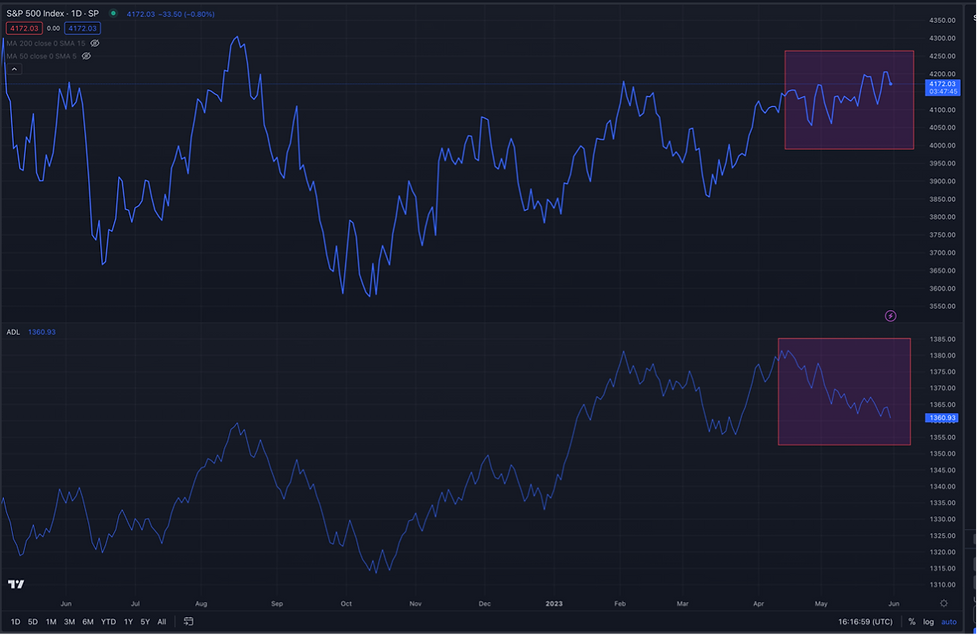
You can see that generally, the Advance/Decline line is moving in correlation with the index, which is typical. A rising market typically sees more stocks moving higher than lower. A falling market typically sees more stocks moving lower than higher. However, you will notice that since around mid-April the lines start to diverge. The overall index is moving higher, while simultaneously the majority of stocks in the index are moving lower. This is a sign of a rising, but unhealthy market.
We see divergences like this when the larger stocks in the index are doing well while the smaller stocks in the index are not. So far this year the top 7 stocks in the index have essentially held up the entire index while the bottom 493 stocks have seen mixed/poor results. Stocks like Apple, Microsoft, and Google are some of the biggest holdings in a lot of our models, so we are not necessarily complaining about them doing well, but in order for us to feel confident in the market strength we want to see the rest of the market catch up.
So, what's next?
We have a couple scenarios that will play out in the following months. The first scenario is that the large tech stocks start to level off while the rest of the market catches up. In this scenario the large tech stocks would not necessarily start to go down, but they would run out of gas and level off around these levels. This would be an ideal scenario and one that would signal a rebounding healthy market with even more upside potential.
Scenario number two would be that large tech stocks start to sell off and the rest of the index keeps performing the way it has been. In this scenario we could see an uncomfortable move down in the market, but likely not to the extent we have seen market declines over the past 2 years. In this scenario however, it is likely that the defensive sectors like Utilities, Consumer Staples, and Healthcare would get a boost, which would be a good thing for our defensive models that have largely not participated in the large tech rally.
Outlook
The outlook for the market has improved significantly since the 1st of the year. Coming into this year the tone of market participants was very pessimistic with the majority of analysts and investment banks projecting that the market had to make one more large move down before stabilizing and starting to move higher. Many analysts from top tier investment banks were projecting ANOTHER 20%-25% move lower in the stock market. Fears of a pending recession were rampant. The question was not “Will we have a recession?” The question was “How bad will the recession be?”. Corporate earnings were projected to tank due to the dramatic increase in the Federal Funds Rate in 2022.
None of this has happened…..yet.
2023 has seen more aggressive growth stocks rally while defensive sectors have lagged, which is a positive sign for the market. We have also seen interest rates stabilize, which could also be a positive catalyst for stocks in the coming months. In our view, more time needs to pass without a recession or falling corporate earnings before the market can move significantly higher, but we are approaching a time where investors could start to wrap their heads around the fact that the most anticipated recession in history may never happen.

The commentary in this article reflects the personal opinions, viewpoints and analyses of the Element Squared Private Wealth employees providing such comments and should not be regarded as a description of advisory services provided by Element Squared Private Wealth or performance returns of any Element Squared Private Wealth client.
The views reflected in the commentary are subject to change at any time without notice. Nothing on this website constitutes investment advice, performance data or any recommendation that any particular security, portfolio of securities, transaction or investment strategy is suitable for any specific person.
Any mention of a particular security and related performance data is not a recommendation to buy or sell that security. Element Squared Private Wealth manages its clients’ accounts using a variety of investment techniques and strategies, which are not necessarily discussed in the commentary. Investments in securities involve the risk of loss. Past performance is no guarantee of future results.


Comments